Som Energia
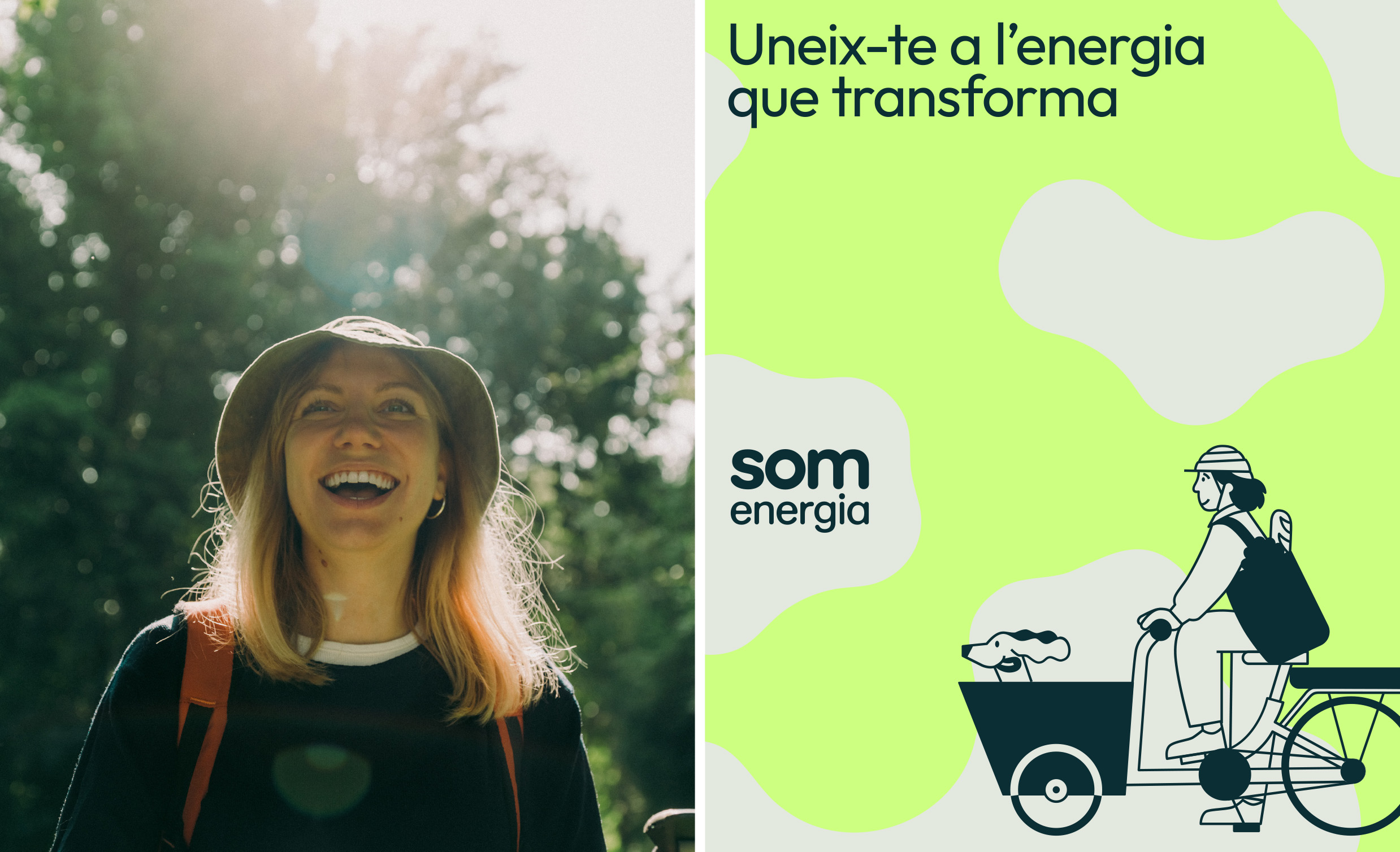
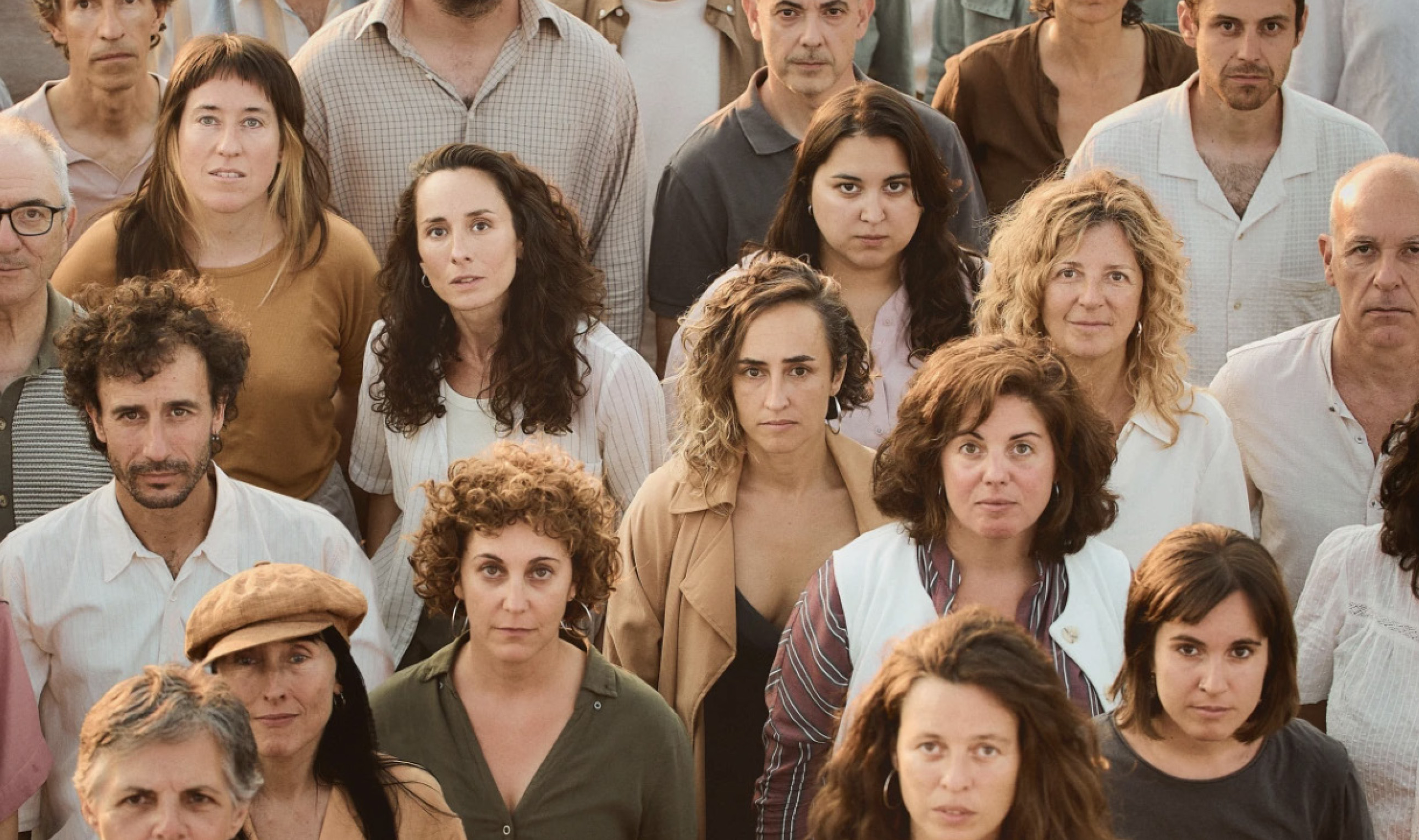
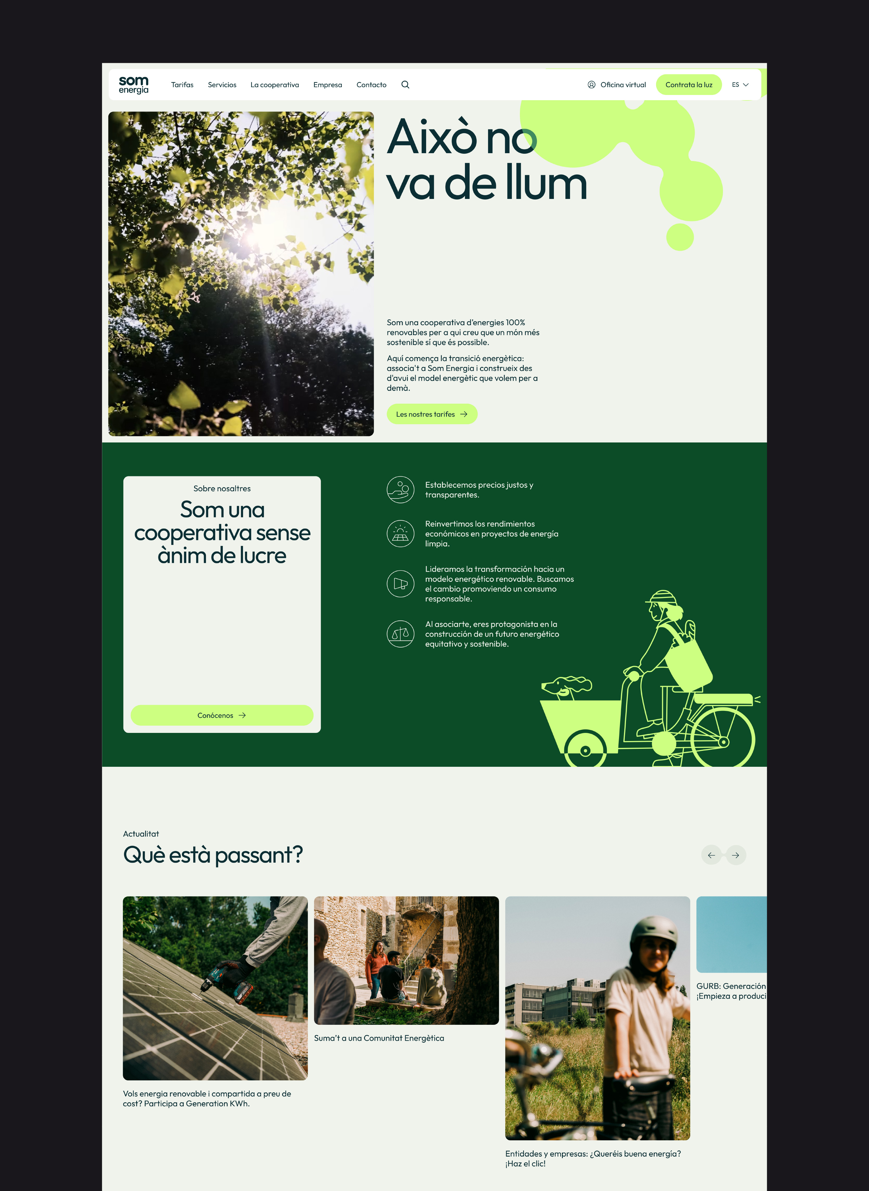
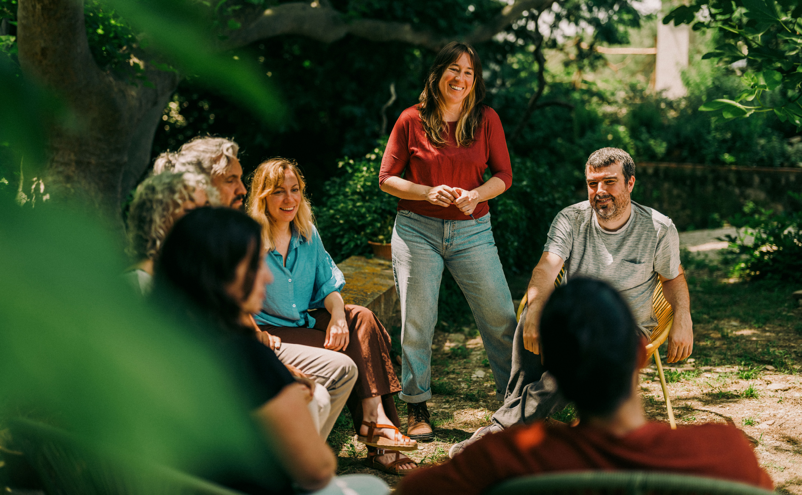
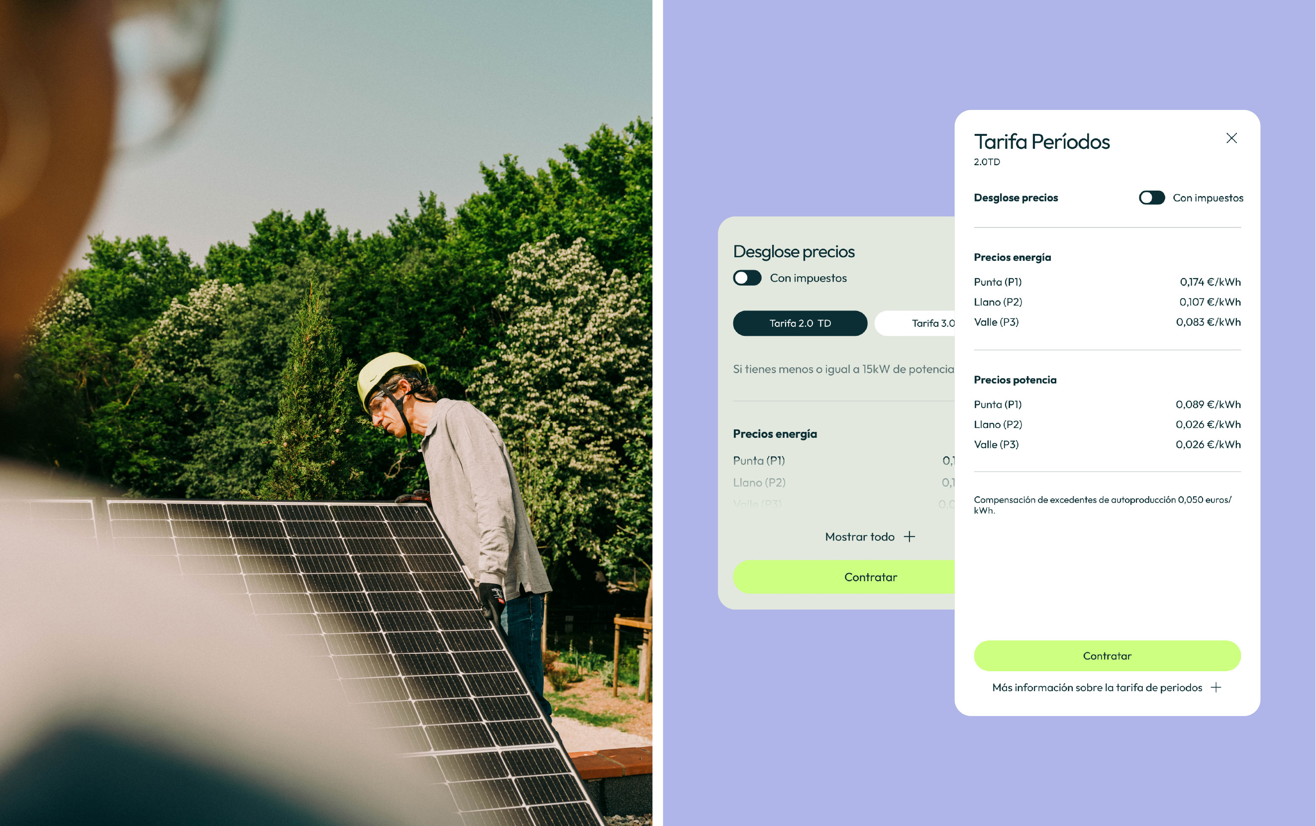
Som Energia is the largest energy cooperative in Europe, committed to 100% renewable energy. After 15 years in the market, they have revamped their entire visual identity to better convey their personality and their core values of advocacy and community.
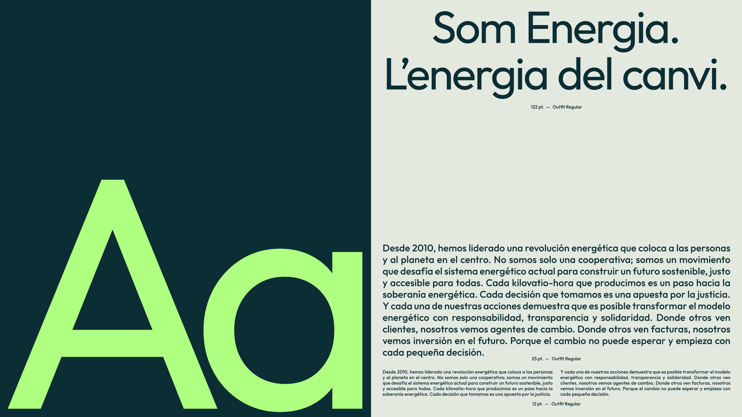
The logotype is just an small redesign of the original, where we removed the illustration of an old firefly, we modernized the typography and offset the weights.
Visual brand identity - Website design - Catalogs - Art Direction
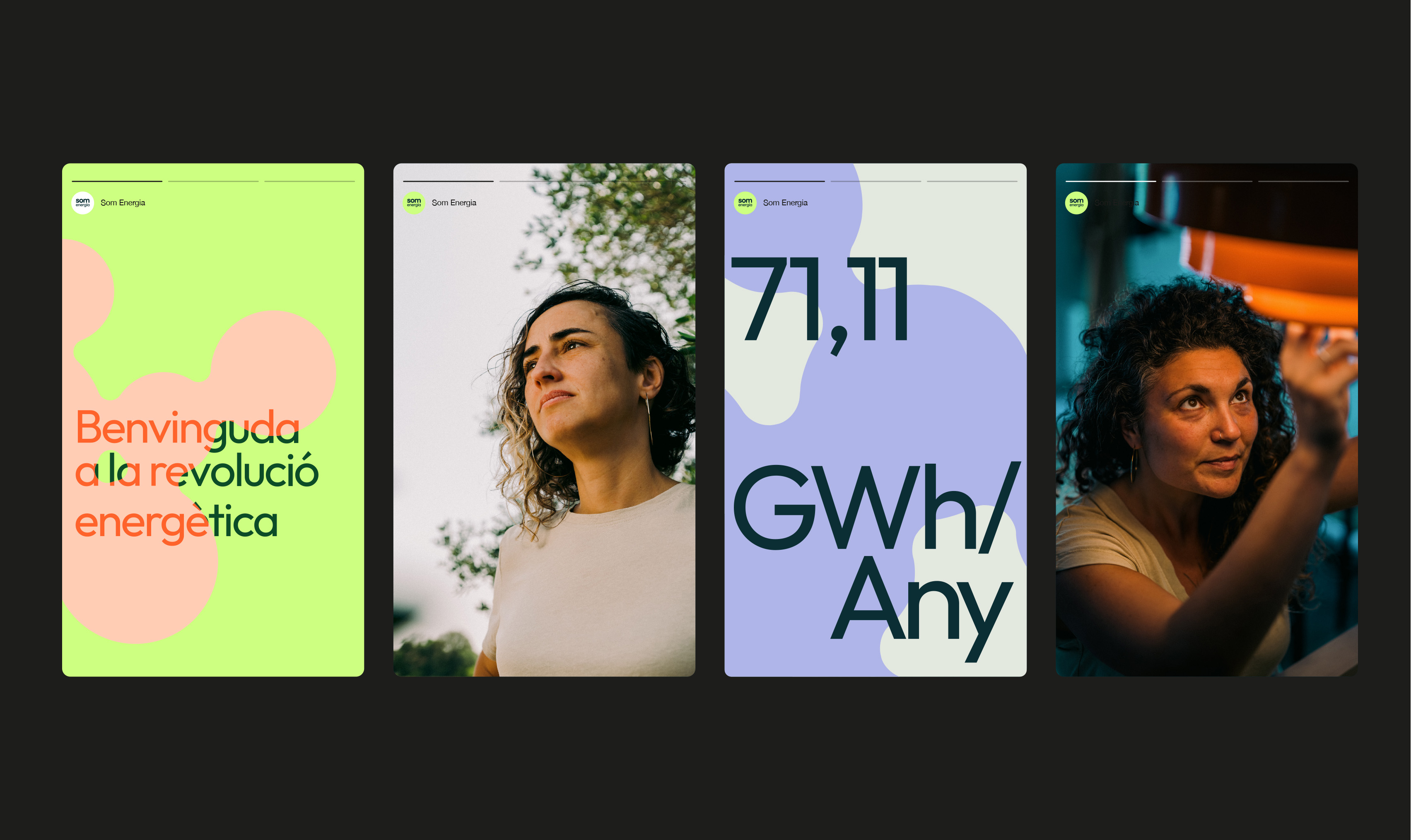
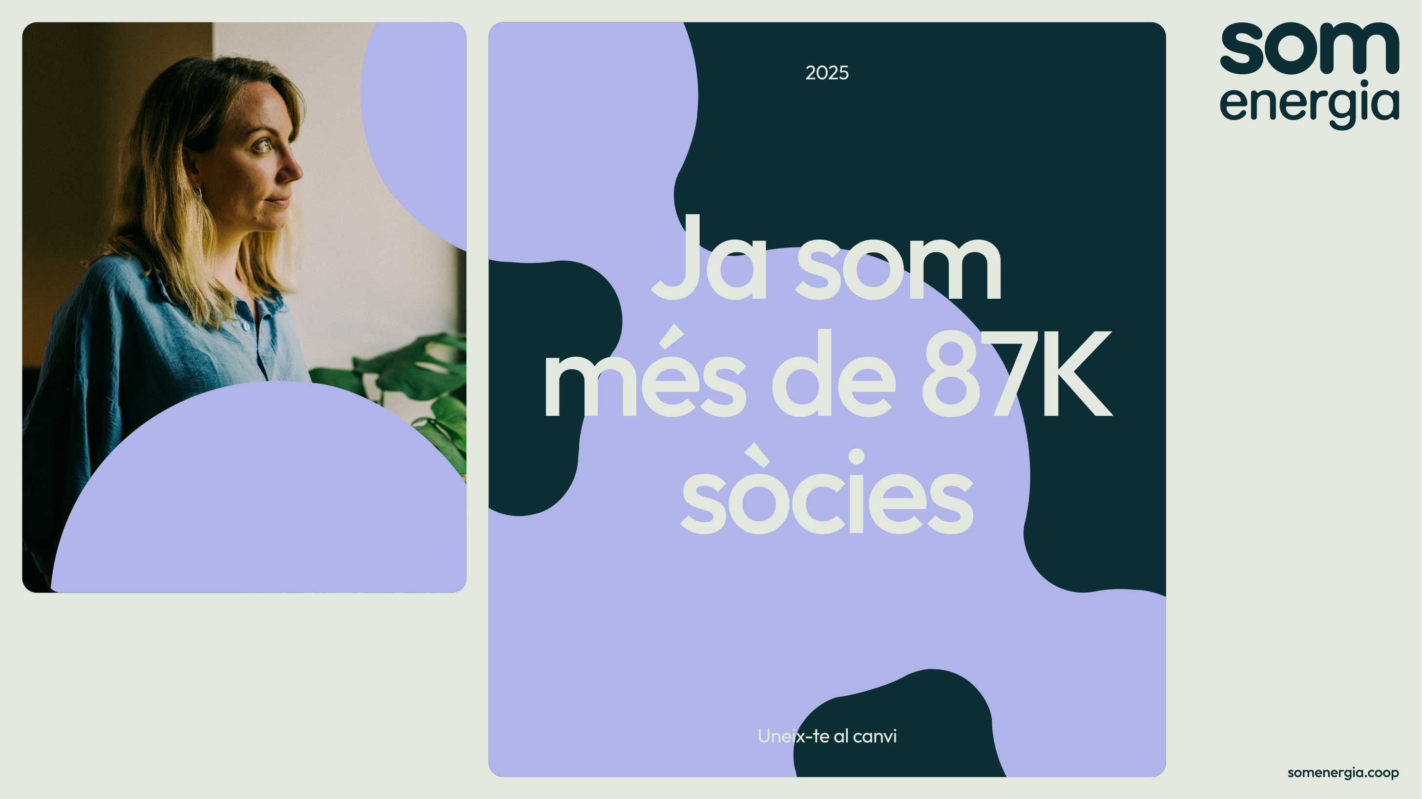
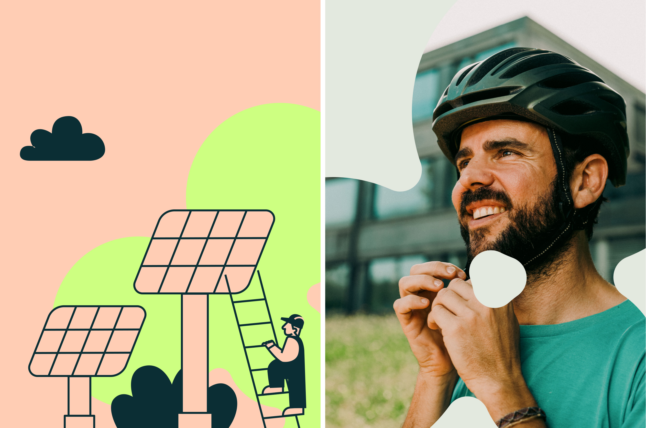
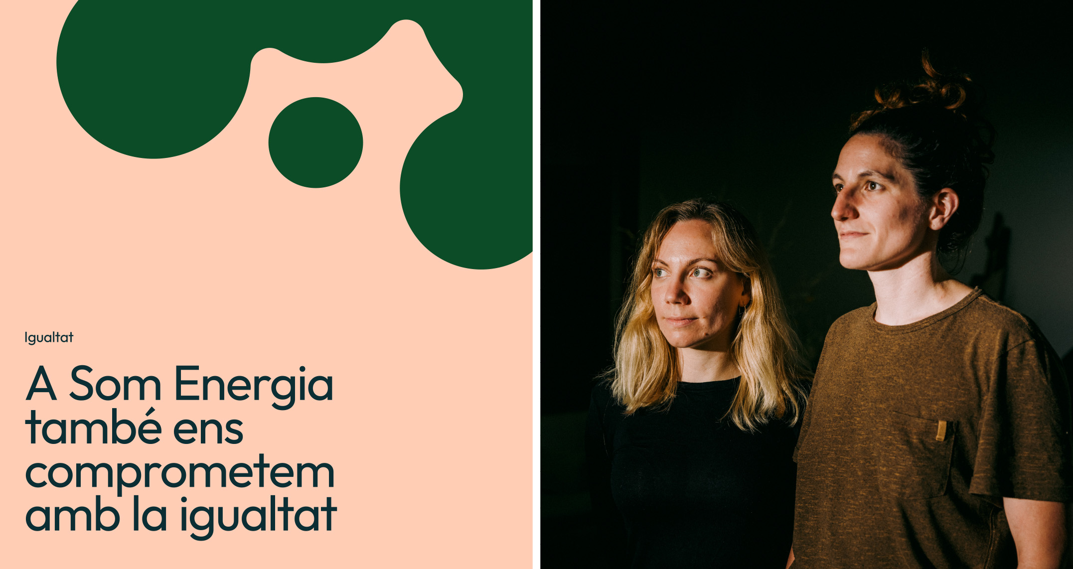
The visual system is based on these organic forms composed of circles that come together and separate fluidly. They reflect the concept of community, formed by people who work together, with the same objective.